According to the filing, Lipnik has been fired from Apple “for failing to follow Apple’s policies designed to protect its confidential information, including development devices and unreleased software and features.” The filing also accuses Lipnik of failing to report “multiple prior breaches” to Apple.
When you sign an NDA (non-disclosure agreement), you’d best protect the secrets. Then again, the guy who left an iPhone 4 in a bar didn’t lose his job. Wonder what the differences are between them.
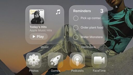
Gross. Why in the world would anyone want translucent icons?
Yes I’d like to strip away my ability to quickly sort mentally by color and I’d love it if there was a background image partially visible intermixed with the thing I’m looking for. Windows phone was peak UI. I don’t think transparency even needs to be a thing in an OS.
What’s old is new again. “Glass” desktops and interfaces have made at least 3 rounds so far.
Willfully breaking an NDA with one of the most litigious companies in the world for what is essentially fake internet points is a bold strategy Cotton. Doesn’t look like it is going to work out for him.
From the article, if you read it, you will see it was not willful at all:
The full complaint, posted by MacRumors to Scribd, outlines Apple’s version of events. Ramacciotti was friends with an Apple employee named Ethan Lipnik, who had an iPhone running an in-development version of the next-generation version of iOS. Allegedly at Prosser’s direction, Ramacciotti gained access to this phone while Lipnik was away from home and used FaceTime to call Prosser and show him the new software design.
“Defendants’ misconduct was brazen and egregious,” says Apple’s filing. “After Mr. Prosser learned that Mr. Ramacciotti needed money, and that his friend Ethan Lipnik worked at Apple on unreleased software designs, Defendants jointly planned to access Apple’s confidential and trade secret information through Mr. Lipnik’s Apple-owned development iPhone.”
Apple Vista
If it comes with the bubbles screensaver, I’m in
Plot twist: the Liquid Glass redesign was just a decoy they hoped would get leaked as a distraction to maintain buzz during the long delays in their secret Transparent Aluminum redesign.
Intent. One was an accident, the other is potentially criminal if I’m not wrong. I could be.
Breaking an NDA (allegedly) is civil, not criminal
Unless it’s also a cfaa violation for exceeding access
I remember when the iPhone 4 leak happened because of that phone prototype that got left behind. Everyone felt really bad for the guy, and it was widely believed that it was completely by accident.
seems incongruous to me that the NDA is that strict but the prototypes are allowed out in the wild. I guess they need real world testing somehow.
Prototypes are not allowed out in the wild anymore. There was a massive shift in policy after the iPhone 4 incident.
It is about managing risk, you do need real world testing for many products, and it is impossible to do that without risking the public sees it (you could camouflage it like they do with cars) , but at the same time it probably isn’t suitable to take an unreleased phone into a bar where the risk of losing it is higher than say a grocery store.
It was in a rounded, 3gs-like case
It would be a civil matter, not criminal.
Based on the article, the youtuber and an accomplice who knew an Apple employee accessed the employee’s phone while it was unattended, so technically it wasn’t intentional and more negligence. On the other hand, Apple also claims the employee failed to report previous breaches, so maybe this was the final straw.
Looks like shit IMO
Kinda reminds me of Windows Aero, but with Grey as your main colour.
That example photo is with the icons set to white (or similar). By default the icons are still colorful. They showed it off during WWDC and it looks mostly good.
Wait what would you call the main color of aero?
Users could choose their own color scheme, default was a light blue.
Oh yea I forgot about that! I miss that. (The color selection, not the….everything else lol. Well, maybe the widgets too.
Yep, when every app has a gray color, it’s much harder to find what you’re looking for on the screen.
Google committed the same sin when they made every one of their apps have the same four color look - now I can’t easily find the one app I’m looking for.
Which red, blue, yellow, and green icon on a white background are you looking for?

solution is to not use any of their apps
The lack of color isn’t the default, it’s an option (an evolution of one that already have). By default everything is still colorful.
I’ve set my Android to the Glass icon pack. It kinda looks okay if the background is very blurry and featureless. Try setting a busy vacation pick as backdrop and you won’t find any of your apps again unless you set the icons to a size normally reserved for the visual impaired.
I’m on the fence, it’s nicer than material design (I’ve always hated ‘material design’ though) but it’s so colourless.
Bring back skeuomorphism!
At least material design is readable.
Actually, in the latest beta, they reduced the glass effects.
In case you missed it, find an iOS beta 1 video and see how they are rendering photorealistic light reflections on the glass UI…

Yeah, the white text on white backgrounds look pretty but is just not that easily readable.
what specific skeuomorphic elements do you want back? it is still there in lots of places and I don’t think liquid design removed any more of it. i also don’t think the amount of color in design necessarily correlates with skeuomorphism.
Always, but it won’t stop people from flocking to upgrade and copying it, and wiþin 3 years it’ll be filtering into Android and Gnome-first distributions will probably make it ðe default þeme.
Oh no, does that mean glassy look will be back the next few years? Bad legibility all over again? 😱
Maybe. I suspect it will be much better than last time.
Processing power is much better now than in 2006. Back then it was about having some blurry transparency and lots of light beams and lens flares and shit, because it was easy to layer that over stuff. This is going to be more about refraction at the edges and clarity in the centers, with frosted looks as background when needed.
I am hopeful, it looked mostly good in the WWDC video, with only a few examples of poor legibility that hopefully will be ironed out.
I’m personally ready to move on from the flat look as long as it remains cleaner than Frutiger Aero. I miss having depth in my UI.
Ten years later, they finally replicated my iPhone 5 jaibreak theme and widgets! Well, partially.
What was that Cydia theming app called… it was titled in leetspeak, I think?
This comment brings me way back haha. I had to look it up because I didn’t remember but it was Winterboard or Dreamboard that I used on my 3rd gen iPod touch.
Winterboard, that’s it!
I think it was the exploits and jailbreaks that were named in leet, like L1meRain
Interesting to read that they actually fired the engineer this time. The last time this was reported (more recent than the phone proto left at the bar), Apple didn’t fire the responsible engineer. I guess that person was too important to let go.
Or perhaps there was something about this guy’s actions that were grossly negligent in a way that any person would agree he effed up.
The article says Apple claims the employee failed to report previous breaches, so maybe it’s the last of multiple strikes.
Did Apple forget their company operates on hype?
Edit: found the Apple fanboys, I guess
did you forget that they’ve been operating this way since at least the beginning of iphone?
I was worried it was gonna be Marquis Brownlee being sued.
Oh no, not the uber rich corpo shill YouTuber 😱